Mastering AI Typography: Generating Perfect Text-in-Image with FLUX
Stop settling for garbled, unreadable AI letters. Learn the natural language prompting techniques to generate perfect typography, logos, and neon signs.
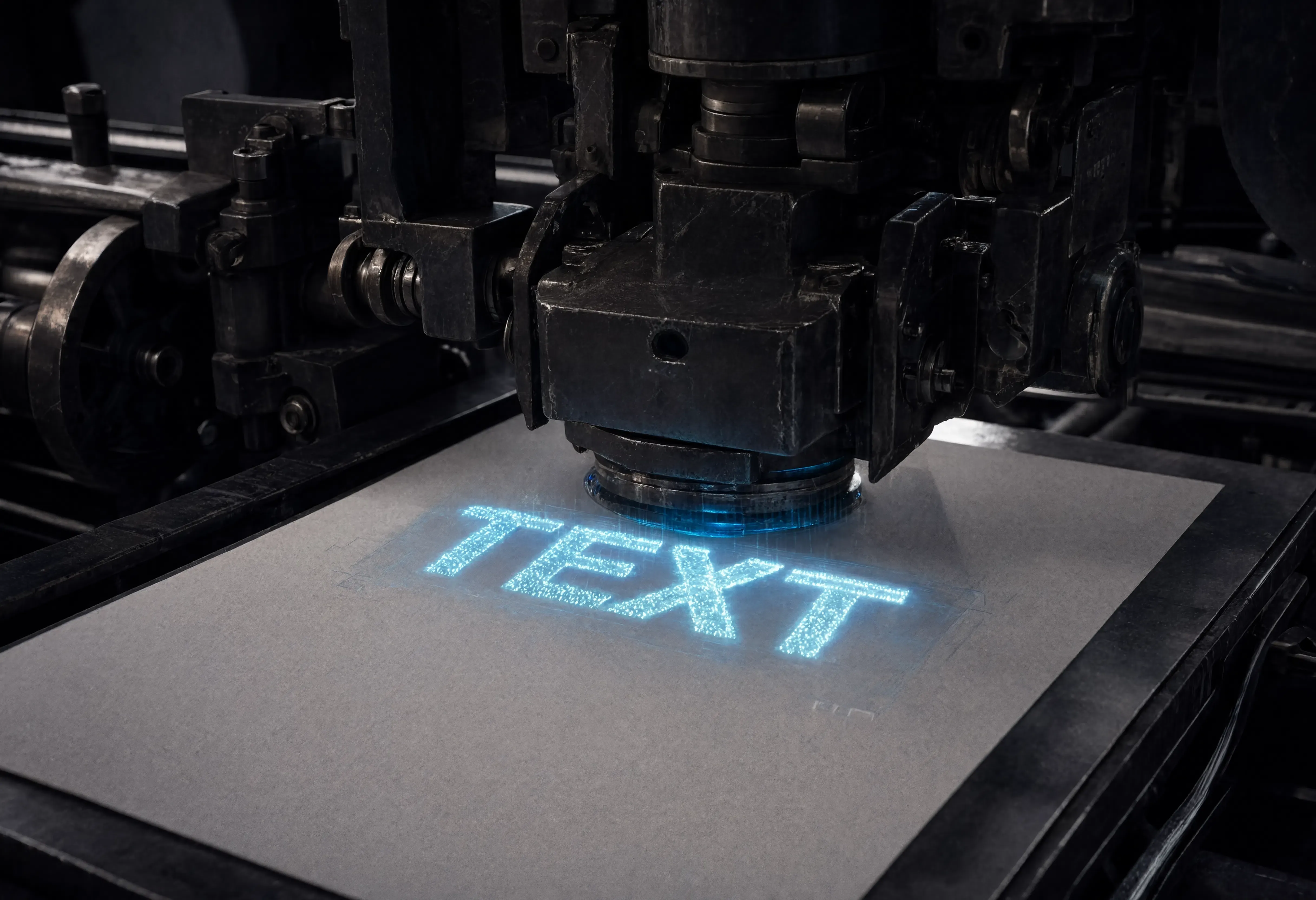
For years, the biggest giveaway of AI-generated art was the text. If you asked for a storefront or a coffee cup, you would get a beautiful image ruined by alien, misspelled symbols.
In 2026, the AI image generation landscape is dominated by open-source ecosystems like FLUX. FLUX uses a rectified flow transformer architecture, which means it processes text and image information simultaneously. The result? Flawless, readable typography.
However, to get perfect text, you must abandon the old "comma-separated" tag dumping. FLUX wants natural language prompts. You must put your subject first, describe the scene like a photographer, and explicitly declare your text inside quotation marks.
Here are three commercial typography formulas you can use right now.
1. The Cinematic Neon Sign (Environmental Text)
Integrating text into a real-world environment requires specifying the light source. Neon tubes are perfect because they cast colored reflections onto the surrounding surfaces.
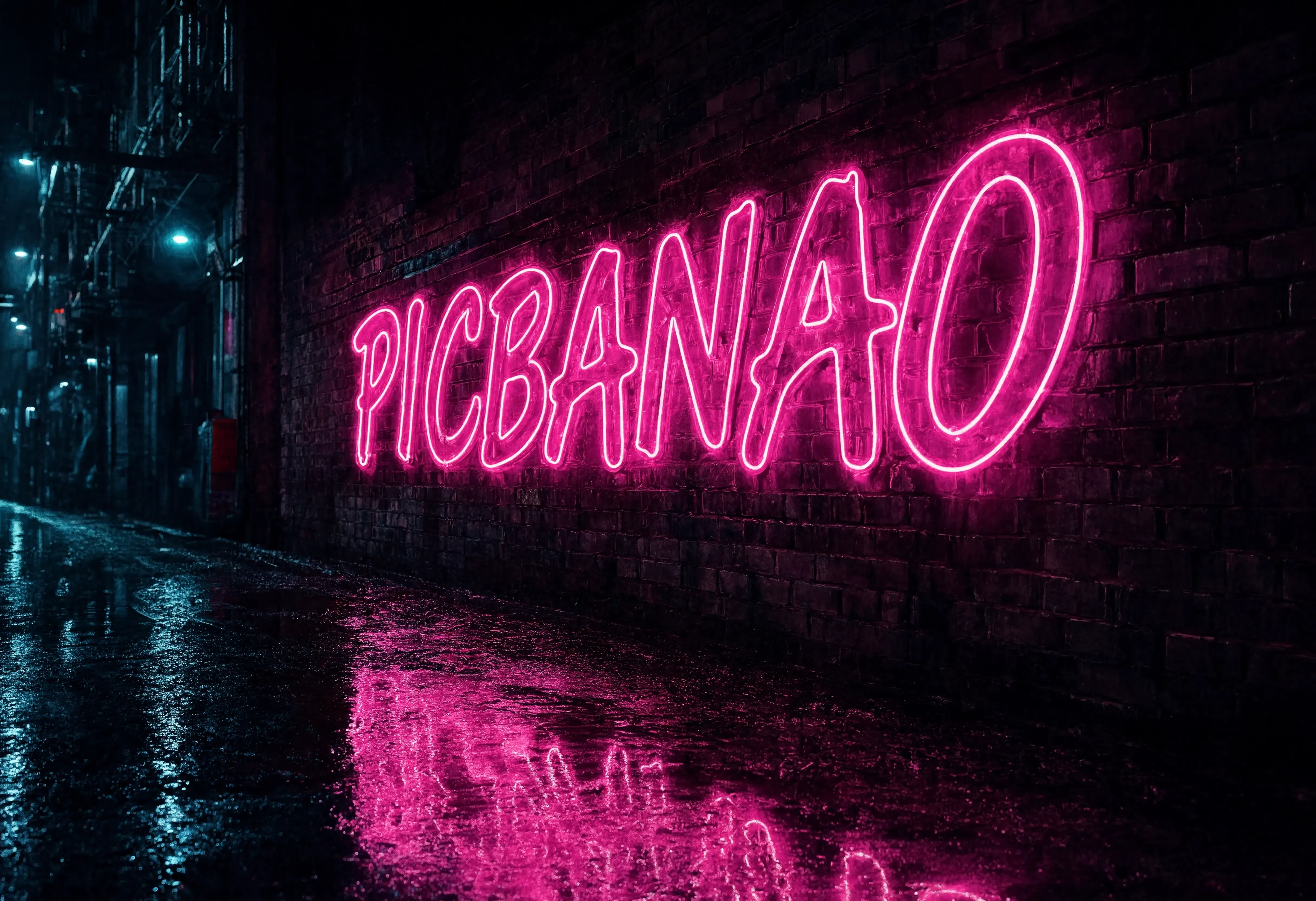
A cinematic 35mm photograph of a glowing neon sign attached to a dark, rainy brick wall in a cyberpunk alleyway. The sign perfectly spells the word 'PICBANAO' in bright pink cursive neon tubes. Cyan puddles on the ground reflect the glowing text. Moody atmosphere, photorealistic.
Why This Works:
- Natural Language Structure: Notice there are no commas or tags like
masterpieceor8k. FLUX ignores those. Write in complete sentences. spells the word 'PICBANAO': Using quotes explicitly tells the transformer architecture to lock onto those exact characters.
2. The Premium Packaging Label (Commercial Text)
If you are building e-commerce mockups, you need the text to map perfectly onto curved or flat physical surfaces without warping.
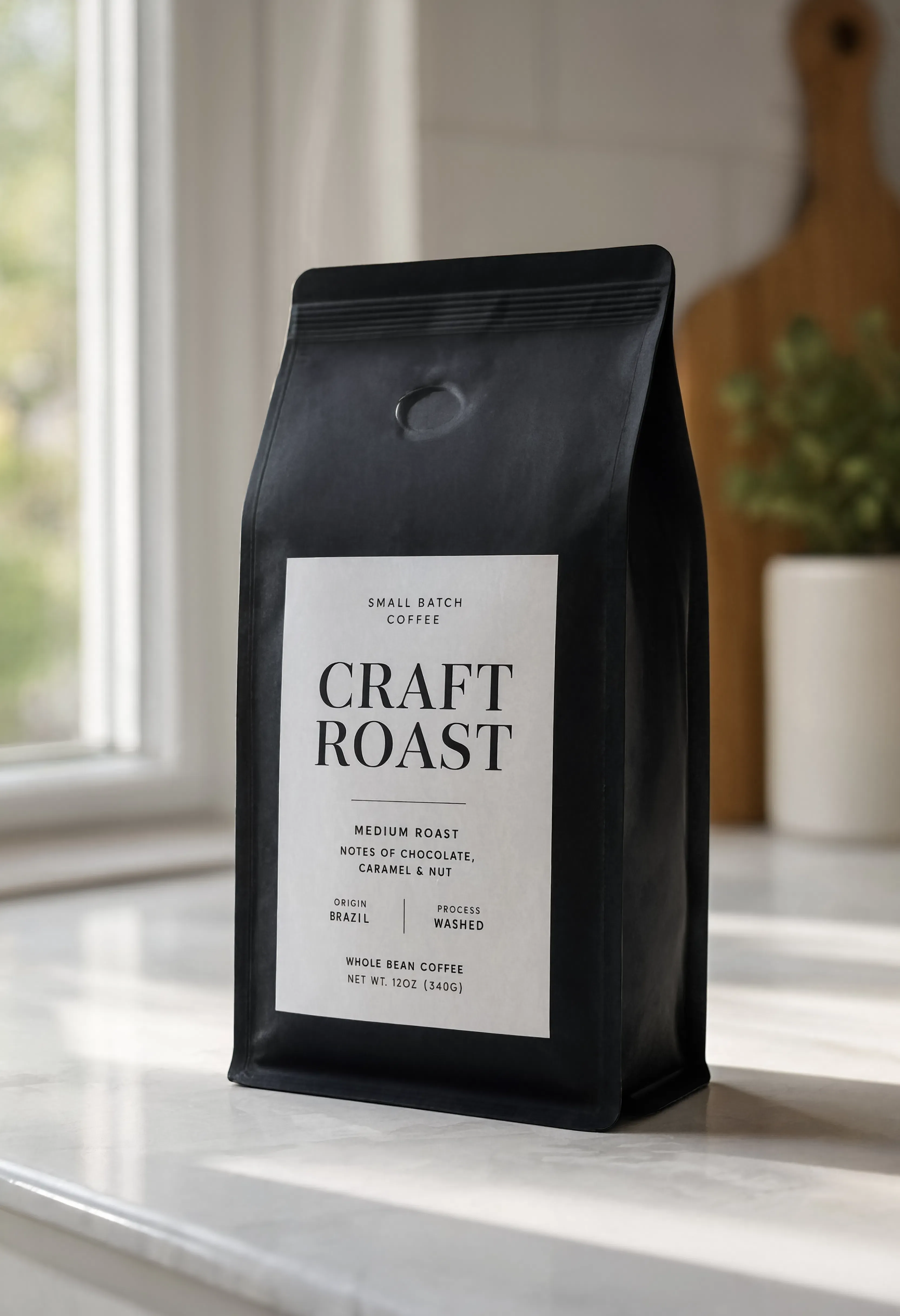
A commercial product mockup of a matte black coffee bean bag sitting on a white marble countertop. The label on the bag is clean minimalist white paper with elegant black serif typography that clearly spells 'CRAFT ROAST'. Soft morning window lighting, 85mm lens, shallow depth of field blur in the background.
Why This Works:
- Subject First: FLUX weighs earlier tokens more heavily. By establishing the
matte black coffee bean bagimmediately, the model prioritizes the physical object before applying the text to it. elegant black serif typography: You must tell the AI what font style to use, otherwise it will guess based on the context.
3. 3D Material Text (Graphic Design)
You don't always need an environment. Sometimes you just want the text itself to be the core 3D asset, perfect for YouTube thumbnails or presentation decks.
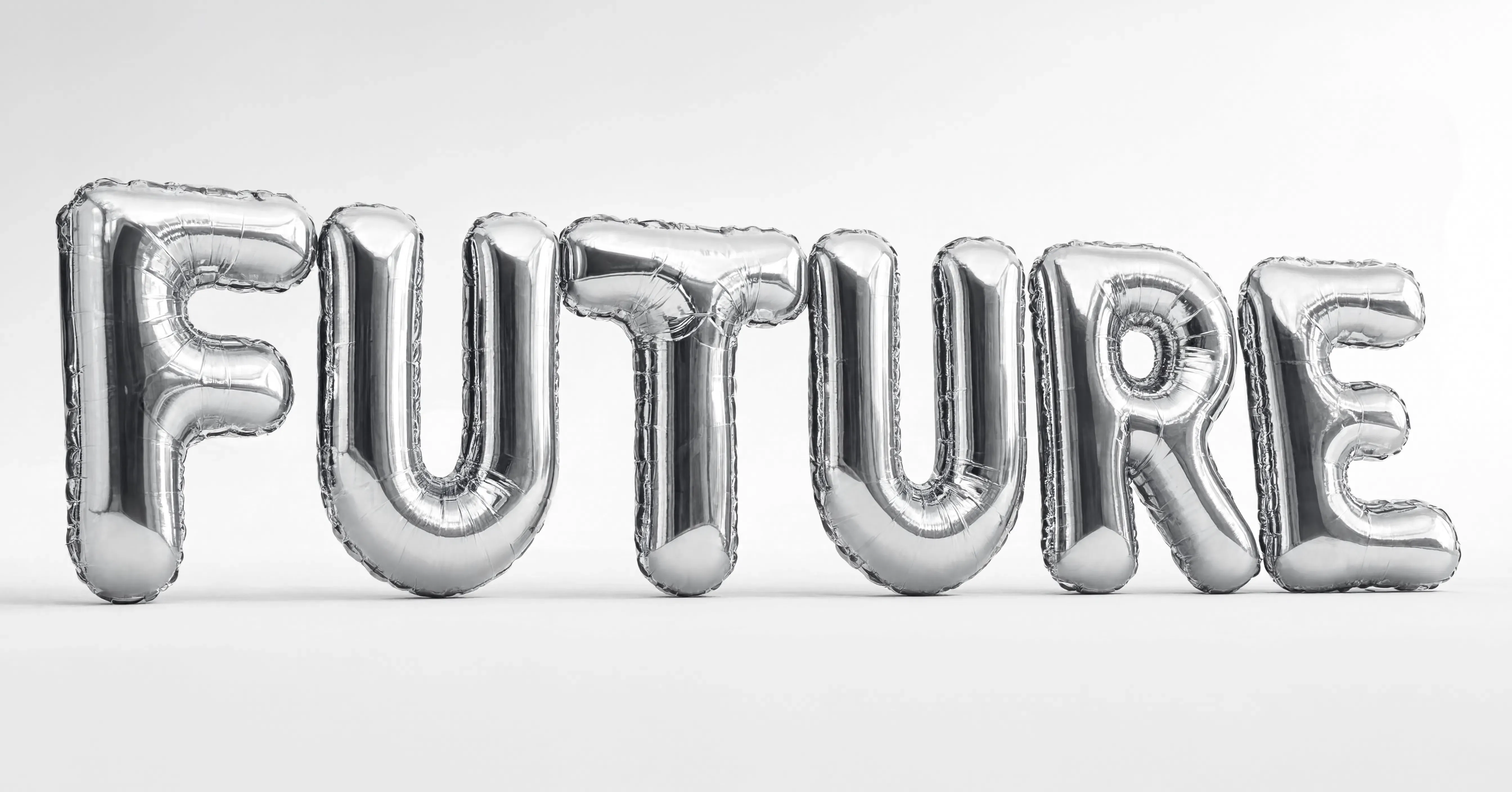
A 3D graphic design render of the word 'FUTURE' spelled out in giant liquid chrome balloon letters. The letters are floating in a stark white minimalist studio environment. Dramatic studio lighting reflecting off the metallic curves of the typography, highly detailed, clean commercial aesthetic.
Why This Works:
- No Negative Prompts: Unlike older models, FLUX does not support negative prompts (e.g.,
no bad text, no typos). Instead of telling the model what not to do, use positive phrasing to demand clean, highly detailed aesthetics.
Summary: The Typography Protocol
To generate flawless text-in-image on modern AI architectures:
- Drop the commas. Write complete, descriptive sentences.
- Put the subject first. Tell the AI what the image is about before introducing the text.
- Wrap your text in quotes and explicitly define the font style (e.g., bold sans-serif, cursive neon, vintage serif).